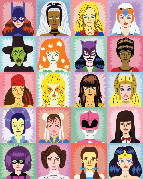
This piece by Jack Teagle was created in 2012 for Urban Graphics' Toasted range. Urban Graphics are a company that is 'design led', focuses on pop culture and specialises in stationary, this design was designed for use on wrapping paper and greetings cards. The image was commissioned after the success of Teagle's initial design 'Heroes and Villains' which is similar in layout but the main subject was male characters rather than female ones.
Teagle has used paint to make this image, although it is not stated what kind I can assume it's gouache or acrylic as the colours are bold and flat - something that would not be achievable with something like watercolour. Even though a traditional medium has been used the image is still clean, crisp and graphic, making it excellent for mass production. I assume that each character was painted separately and then composed as a whole later using digital media, as I have seen this image but with extra characters or with the characters switched around. The image is in grid formation and makes for a good loopable pattern, which makes it an effective design for wrapping paper. The company, Urban Graphics' stationary etc is sold in many different stores including Paperchase, Waterstones, The Tate Modern and Urban Outfitters. The place the items are sold and their focus on pop culture suggests that the target audience of their work is a younger, teen - young adult generation.
The image pictures iconic female characters, both heroes and villains from pop culture. The characters are somewhat stylised but definitely recognisable. Each character is framed by a colourful background and a spiky, comic book style shape around the head. The male counterpart of this image is done in a similar style, with differences in colour and positioning of the characters. The female image is much more pastel and typically feminine in colour whereas the male image uses darker tones, which gives it a somewhat vintage look.

These two images are designed for males and females. The typically feminine colour scheme paired with all female characters - meant to appeal to a female audience whereas the darker more masculine colour scheme to appeal to males. It's interesting how 'Heroines and Villainesses' was made after the initial success of 'Heroes and Villains' suggesting there is more of a female audience for comics than previously thought. 'the representation of gender is one major battle in a wider war for the soul of geek culture'...'all those people who are not straight white males are quite rightly demanding they are represented in geek culture.' (Walter, D, 2012)
By segregating the male and female characters into different images it helps to highlight how many strong female characters there actually are, as sometimes female characters can be bypassed 'most (people) being unable to even name any other comic book heroines (than wonder woman) reflecting on what little exposure these characters get in the industry' (Madrid, 2009: vi/vii). Also girls are shunned in 'geek' societies, Elizabeth Walker states 'They scoffed because I was a chick, reading the soft stuff in graphic novels...They scoffed because I wasn't suffering' (Pohl Weary, 2004:210). An image like this that centres around female characters for a female audience helps to bring girls into the culture. However this may give a very set in stone 'this is for girls' , 'this is for boys' nature - alienating each gender from the others' things rather than creating an all inclusive environment.
The portraits of the heroines is a simple yet appealing layout. The viewer is able to see the characters and there is a sense of power that exudes from them, despite this image being just a wrapping paper design. 'Any power these women may have is often overshadowed by their overly sexualized images' (Madrid, 2009: vi), by not portraying these characters in a sexual way as they often are in comics Teagle has a) been able to capture the female characters with an equal essence to the male characters, and b) made the image more appealing for females, as the female characters are not sexually objectified.
 |
| Fig 1 |
 |
| Fig 2 |
 |
| Fig 3 |
 |
| Fig 4 |
 |
| (bonus) Fig 5 |
 |
| Fig 6 |
Madrid, M (2009). The Supergirls, Exterminating Angel Press , USA
Pohl-Weary, E (2004) Girls Who Bite Back: Witches, Mutants, Slayers and Freaks, Sumach Press, Canada
Walter, D. (2012). Women are Fighting back in the Battle for Geek Culture. Available: http://www.theguardian.com/books/2012/jun/19/women-fighting-back-battle-geek-culture. Last accessed 5th Nov 2014.
Fig 1. Rory Midhani (2013) Drawn to Comics [Autostraddle Column Header]
Fig 2. Sherwin Tjia (2004) Slumpyheroes [Unknown] Found in 'Girls Who Bite Back - Emily Pohl-Weary
Fig 3. Russell Dauterman (2014) Unknown Title [Thor Comic Art]
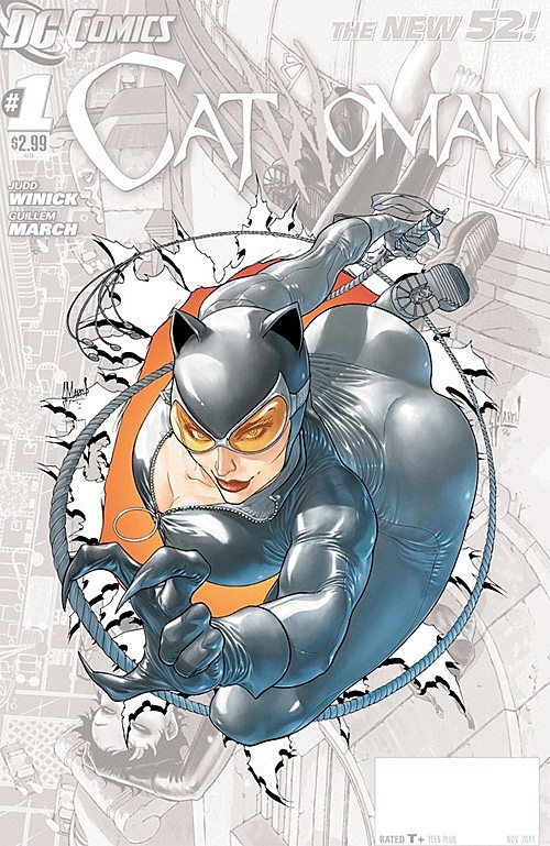
Fig 4. Guillem March (2012) Unknown Title [Catwoman Comic Cover]
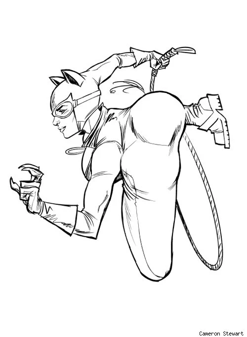
Fig 5. Cameron Stewart (2012) Unknown Title [Reinterpretation of March's Catwoman Cover]
Fig 6. Jamie Hewlett (1991) Unknown Title [Comic Cover]


