Wednesday 11 January 2017

Summative Statement

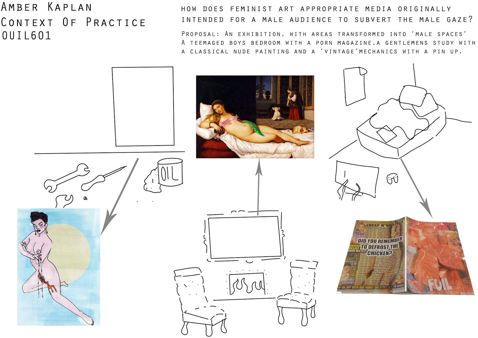
My research project focused around the question “How does feminist art appropriate media originally intended for male consumption in order to subvert the male gaze?” The dissertation focuses around different practices that challenge the ideals of a patriarchal society and thus the gaze. My essay project is based on Laura Mulvey’s Gaze Theory, with much supporting research from John Berger, Rosalind Coward and Rebecca Schneider.

I investigated feminist artists, specifically the work of Hannah Wilke though I also explored the work of Annie Sprinkle as well as burlesque performance and feminist intervention, and the methods the practitioners use to subvert the male gaze.

The practical side of my research project is mainly based on these findings, and the language of male orientated media. I have also looked at questions of intent of the author and whether sexual agency can be fully communicated through illustration. I found through the project that many works that end up subverting the male gaze uses a similar visual language, however the piece will not fully subscribe to the male expectation of the media.

The project led me to create a modified porn magazine using the magazine ‘escort’ as a basis, and altering it with photomanipulation. This method synthesises with my research question, as I myself have created a piece of work with the intention of subverting the male gaze, by re-appropriating media that was originally intended for male consumption. The work created has different elements that link to the theories discussed within the essay, for example the use of eyes as a motif to turn the gaze back on the viewer.


A massive theme I have found is the use of similar visual language subverting the gaze, as "when the familiar is made strange, when the norm is recognised as queer" (schneider, year, p.45) male comfort diminishes and male power is challenged.  

Presentation Boards

Visual & Conceptual Development

Evaluation of project


COP3 draws to a close, so let us take a moment to relax and reflect with a good old evaluation of the project. 

This module has been a challenge, as COP usually is but I had a lot of fun doing it! My project based around the question "How Does Feminist Art Appropriate media originally intended for male consumption in order to subvert the male gaze?" I think I made a good choice of question as I didn't really have to change it too much from what I started with. I toyed with a lot of ideas over summer that my brain was getting a little overloaded, but through exploring this question I think I actually ended up including a lot of the points I had initially including ; authorship, censorship, the vagina dentata etc. 

I know I did not manage my time well. I never do. I did make some attempt to, but it felt like so much was happening at once. I enjoyed working on the dissertation and theoretical side even though I don't feel confident with my writing, the writing side of my project always ends up stronger than my practical side. 

My practical work started off slow, I was definitely behind for some time. A lot of people had a product they felt they wanted to do but I didn't have that strong feeling at the same time, so I feel like I rushed myself into choosing a product which was appropriate, which was the magazine. Technically I have improved photomanipulation skills and my final magazine product relates well to my dissertation question. There is synthesis in the fact my product is partially made from media that was intended for male consumption, but I have altered it so it subverts the gaze. I have done this by identifying key visual techniques in male-orientated media such as the passive look of women and how they are unaware they are being looked upon, the erasure of bodily functions and features such as body hair, the mystification of the female body - and finding ways of drawing a lot of attention to this - for example the use of eyes in unconventional places to turn the gaze back on the viewer. I loved how the magazine turned out as it does genuinely look just like a magazine, thanks to the glossy thin paper down in the print dungeon. 

My one regret for this was not doing loads more drawing and exploration of the project. I really wish I'd just done tonnes of drawings to work from. In the end I did some little experiments with pin up drawings to bring some traditional work back in, I didn't want to force it though, but I thought it was still relevent to the project. I wish I'd given myself more time to make weird gif's because I think that weird blinking gif was one of my favourite pieces from this project. Maybe a sign I should do more gifs in the future. 

Overall I'm happy with the progress I've made in this module, I think I've gained more research skills and developed some very different skills (photomanipulation, using indesign) that I can use in the future. 

Exhibiton Proposal


While I spent a majority of my practical time working on the magazine I wished I had the time to do more stuff. I thought there must be a way to reflect more representations of women created for male consumption, and making them weird.

The concept is an exhibition space with different masculine spaces. 
A teenaged boys bedroom in which the modified porn magazine is
A vintage garage with a modified pin-up on the wall
and a 1800's style 'gentlemens study' with a modified classical nude 
The exhibition would be interactive and I intend to be able to show people how the male gaze had influenced media through several different eras. 

I'd already worked on some pin up concepts for this. (see a previous post) 
but I didn't have enough time to get what I wanted done for the classical painting so I have done a quick digital mockup to get the point across in my presentation board. 


Dissertation

My Dissertation in it's final form

PIN UP CONCEPTS // FINISHED NOT QUITE FINISHED


I really wanted to do something a bit more traditional, and figured I had enough time to whip up a couple of these for my exhibition proposal. 

I have used the same themes that run throughout my work, linking the theme of my dissertation - appropriating media for male consumption, in this case the pin up, and subverting it, via the weird additions such as eyes in different places, the vagina dentata, and the disappearing woman. 

Although this is not technically my best work, I really wanted to have something more in my personal style for this project, as I believe the magazine responded and worked well with the research project and had my weird tone of voice but I feel wasn't all me! I think If I'd made a fully illustrated version it might have suited me more? I still like what I've produced, I think its a good parody of lad culture! But I believe this is also appropriate to the project as it shows a different era of male-orientated media. 

I tried to add textures to sort of mimic the pin up drawing style, but I'd definitely consider these more concepts than finished outcomes to anything. 

Thursday 5 January 2017

MAGAZINE

I am relatively pleased with the final prints of my magazine response to this project. 

What am I pleased with?
  • I believe the concept of the piece was definitely solid. It responds to my dissertation question, "how does feminist art appropriate media originally intended for male consumption to subvert the male gaze", as I have appropriated the porn magazine within my practice and altered it to subvert the gaze. 
  • People who have seen it have immediately thought it's just a regular porn magazine when they initially look at it, which is what I was going for. It's more fun when people pick it up and look through before realising it's weird. 
  • Most of the content works well. Use of photomanipulation, could have been horrible but ended up being more straightforward than thought. I think the creepiness factor is up when photography is mixed in as 'photography implies truth' when really people in magazines are edited a lot. 
  • The paper! Luckily the digital print room had this thin glossy paper that was perfect for printing a magazine onto, because it made it all shiny and authentically tacky! Makes it pass as an actual porn mag better. 


Weaknesses:

  •  Due to my poor time management I did not manage to do some things that would have made this more successful. 
  • I would have liked to have edited some of the text so it said funny things! I did try this on an advert but it was really difficult to match the colour and retain the texture so the text could be covered. 
  • A critique I got from a friend was that all the vibrators should have been replaced with hot dogs or bananas, I agree that would have been funny, but I just didn't think of that. 
  • I feel like there's always room for improvement in terms of my crafting, I'm always learning. 
  • I would have liked to have done more sets and have them evolve more fluidly into weirdness
I made the choice to not edit all of the images on each spread, as I thought it would help the disruption to only have a few. I think it makes people look closer at the regular image thinking there must be something wrong with it, and kind of realise how weird the images are without the extra editing. The people I've shown it to have so far found it uncomfortable that some of the images are not edited but are unsure whether it's a positive or negative.

"Did you remember to defrost the chicken" - In all honestly, I was struggling with a back cover and couldn't have nothing. I wanted to put something on it completely unrelated to sex. I experimented with a tampon box but in the end went with the quote. My thoughts behind it are that the demographic who look at this kind of thing are usually teenaged boys whose mum's will have told them to get the chicken out of the freezer for when they get home from work, so it serves as a friendly reminder to do that before she gets home!

I believe whether this is a well made piece of work or not, it's definitely achieving what I intended it to do. 


Wednesday 4 January 2017

PRINTING THE MAGAZINE


The Spreads & Printing off The Magazine
Using INDESIGN.
Pretty straightforward, didn't have to do anything I didn't know to do, spreads mostly fit on well. 
I included the image I wasn't so happy with just because I wanted something for the middle to be a poster. 
seeing it all together in indesign really pulled the whole thing together for me.
Some of the images are really simply done things because I didn't manage my time well, but I tried to get the insides looking how I wanted, and the front covers I thought fell down a bit but all the feedback I've had on them have been fine. Usually met with "you made this???", so it looks legit. 


Tuesday 3 January 2017

Photo-Manipulation Development

I found photomanipulation pretty fun and unsettling because you can almost make things look real.

Some of the elements I made more subtle than others.

The flesh melding together I find pretty uncomfortable as it's so subtle you almost wouldn't notice it unless you looked for it. It definitely unsettled everyone I knew.

Some of these were difficult to make as it was hard to gage how weird was too weird? I didn't want to overload the weird I kind of wanted it to subtly seep in, however it ended up just getting pretty weird.


I said to a friend "what if I drew over it so the vagina was like... a drawing" and she replied "no, it would be too much like the 'take on me' video", so that's exactly what I went for, and I selected the 80's themed set for it. I love it. It's one of the less offensive spreads I have made for this project. 

These subvert the male gaze by defying male expectations. Sometimes in a more covert way. The image doesn't have to be horrifying to disrupt the gaze, it just has to go against what a male audience would expect from the image. 

Monday 2 January 2017

Hollie McNish - Embarrassed

https://www.youtube.com/watch?v=-2z-Cd3luqA

There's a video for it I hadn't seen!

Pin Up drawings!!

I had a pining to do something more illustrative, and also thought that doing this would demonstrate a reflection of other media intended for the male gaze such as pin up art and classical painting.

also it meant my initial sketching stuff didn't go unused, obviously it informed the photomanipulation work I did, but I would like a broader range of work for this project, as then I could reflect different media that was created for a male audience.

To make sure they are obviously pin up related I have actually traced Gil Elvgren drawings, and modified from there. This made things easier as I didn't have to worry too much about body proportions and positioning. Some may call it cheating I call it using my initiative.


I used the same kind of motifs that have been running through the rest of my work. All eyes and vagina dentata's, with some added menstruation connotations all to add to the discomfort for a male viewer.

Kind of thinking I'm going too gory with these pictures? I started off just wanting to do some subtle weirdness but I've gotten a bit over the top with all of this. However I do think these images are still successful in the goal of subverting the male gaze by appropriating media, as at a glance I believe they still look like regular pin ups but it becomes clear that they diverge from male expectations.

Sunday 1 January 2017